Wilson Journal
client:
International Relations Organization
description:
The Wilson Journal of International Affairs is a twice-annual research journal. If it has words redesigned the journal from the ground up, including a new logomark, logotype, cover design, and interior.
date:
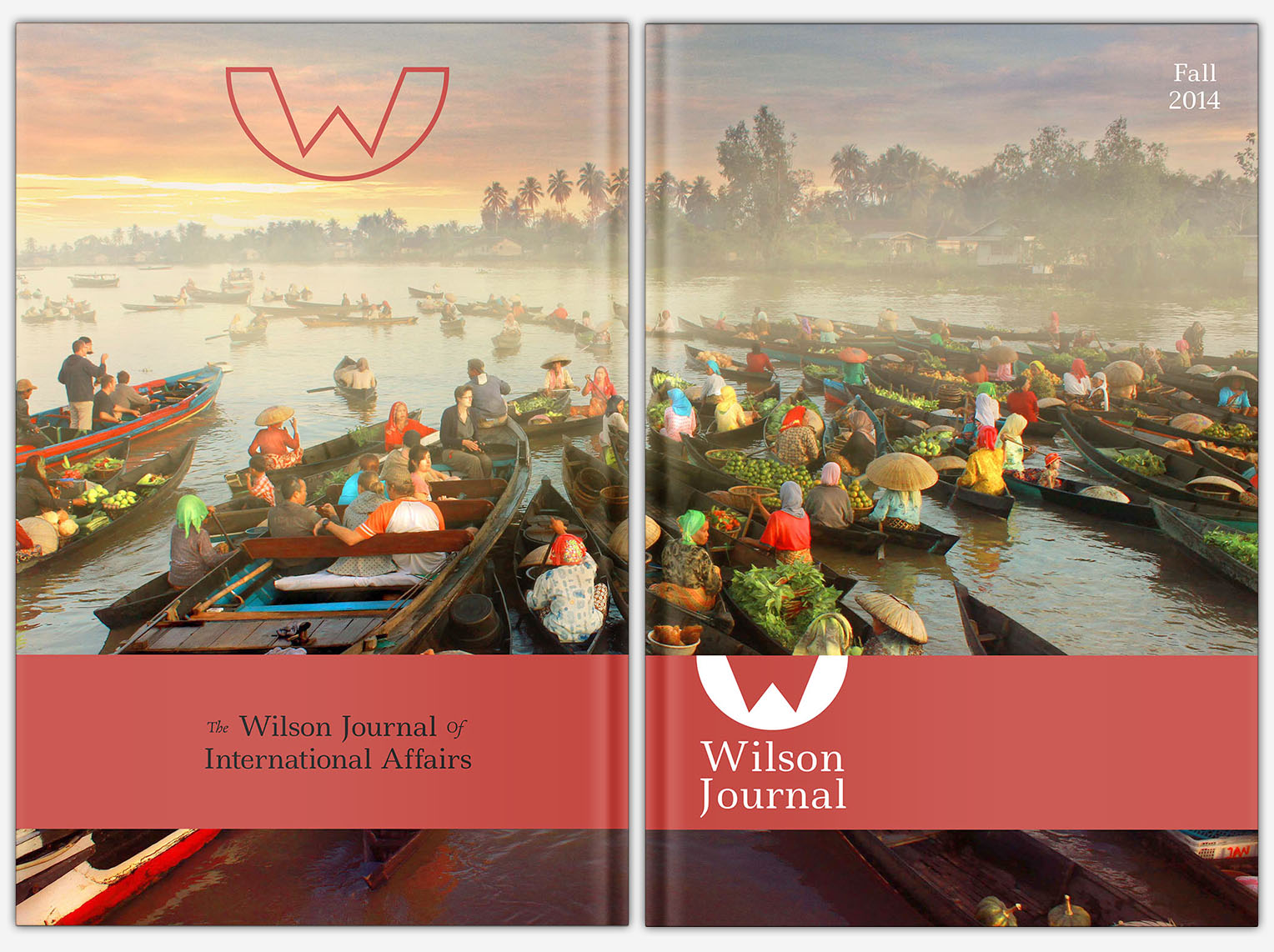
Fall, 2014
work:
Logo design, editorial design, graphic design
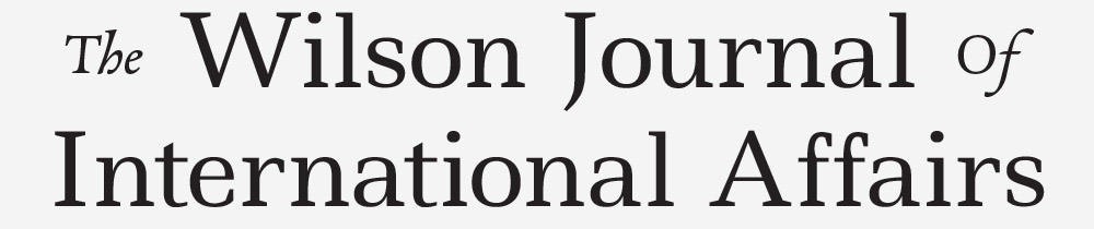
Logotype and logomark
The Wilson Journal Logotype features Ledger and Alize.
The Wilson Journal logo mark is simple, memorable, and distinguishable. It fits the eyes with a 2:1 width–height ratio.
Color
The interior of the Wilson Journal uses no color. The exterior and web presence, however, use three main colors.
Typography
I wanted to provide the Journal's meaningful content with an straightforward reading experience. The typographic hierarchy helps make this possible: clearly defined header levels, highly-legible body text with ample leading, separated blockquotes, and discrete captions.
Ledger—Headers and logo
ABCDEFGHIJKLMNOPQRSTUVWXYZ
abcdefghijklmnopqrstuvwxyz
0123456789@#$%*&(!,.;:?)
Adobe Caslon Pro—Content
ABCDEFGHIJKLMNOPQRSTUVWXYZ
abcdefghijklmnopqrstuvwxyz
0123456789@#$%*&(!,.;:?)
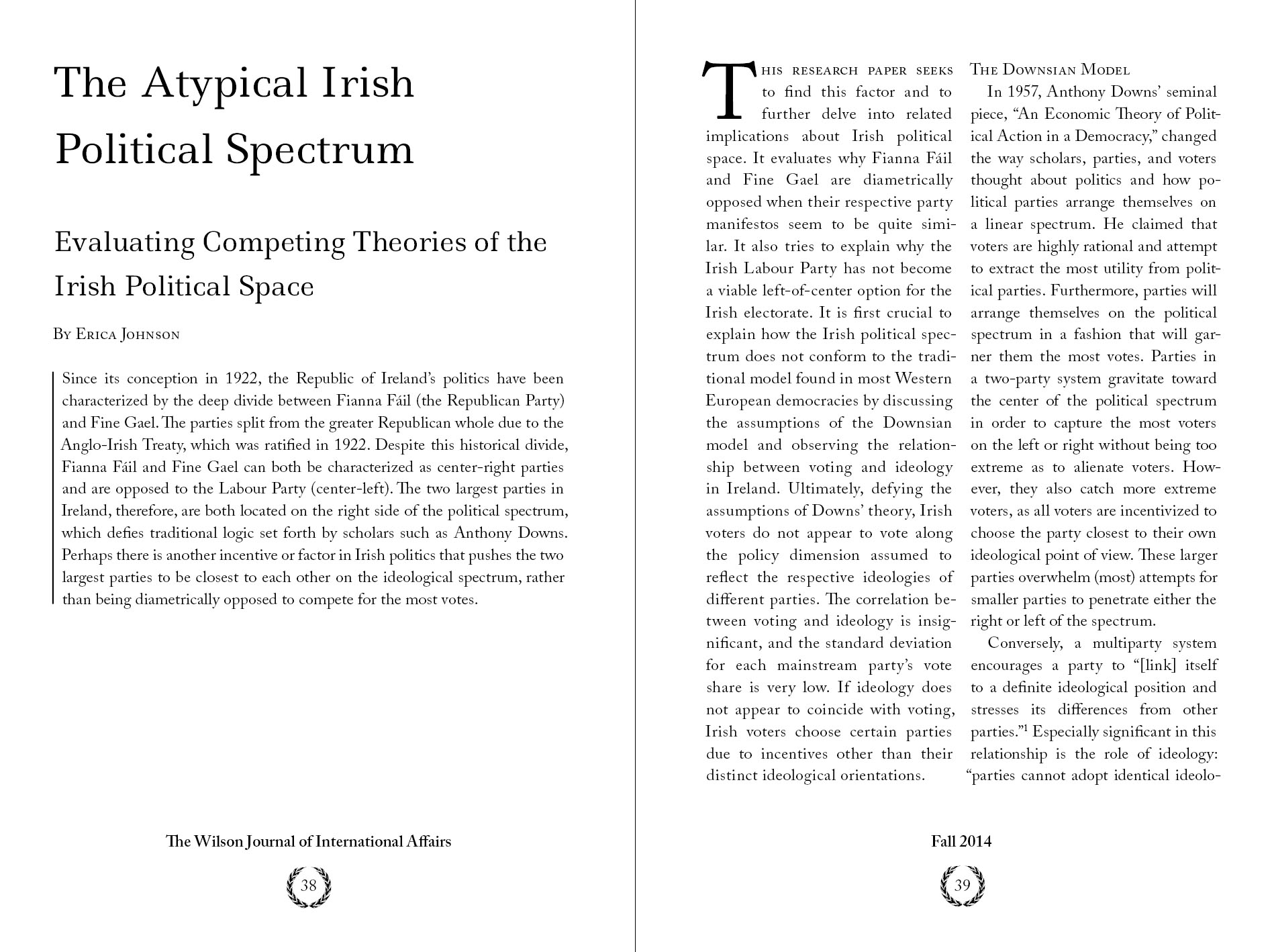
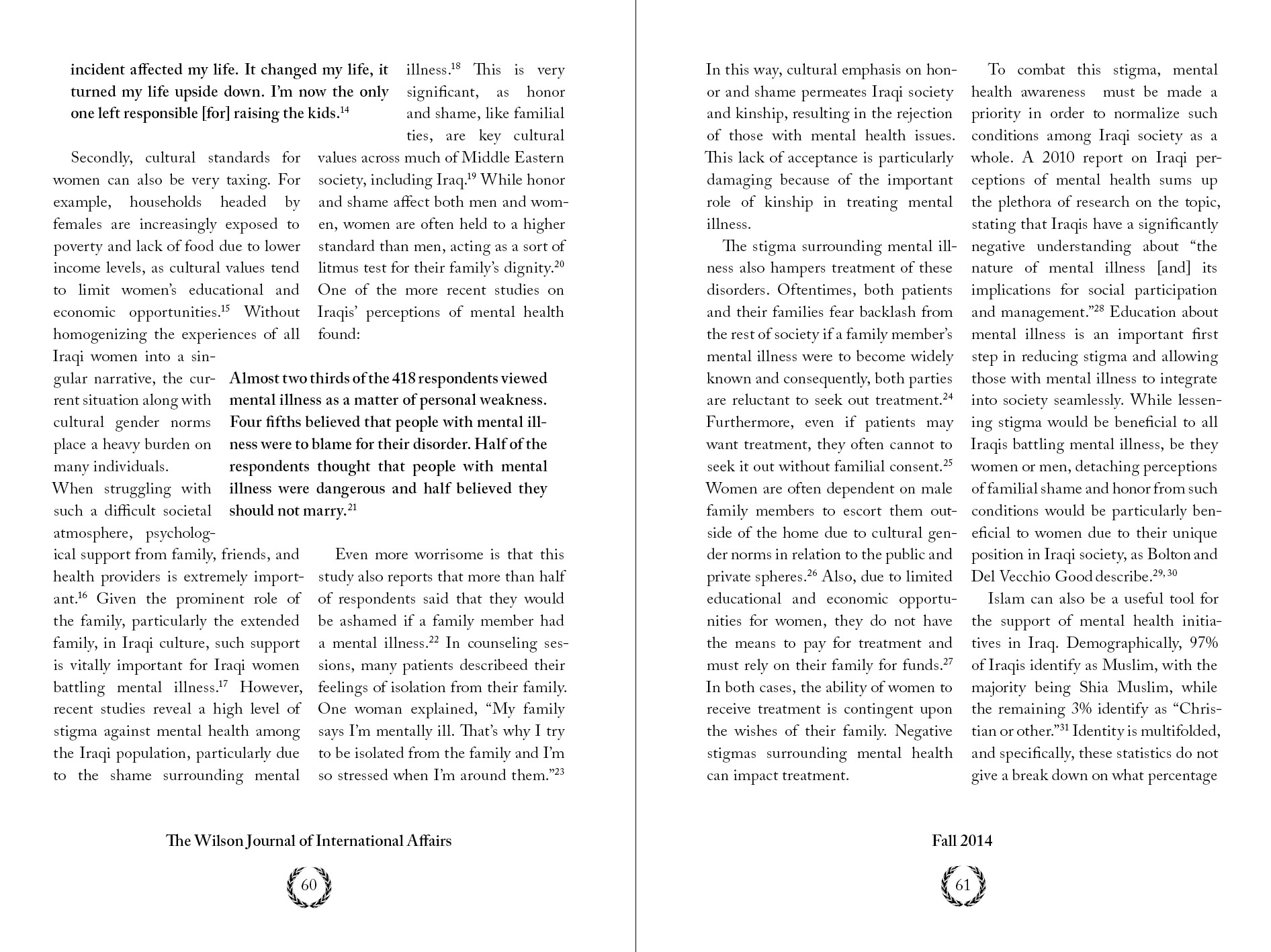
The Wilson Journal needed a consistent and pleasant reading experience—it's dense content providing enough of a challenge. To accomplish this, I used a six column grid structure and framed the content in plenty of white space.
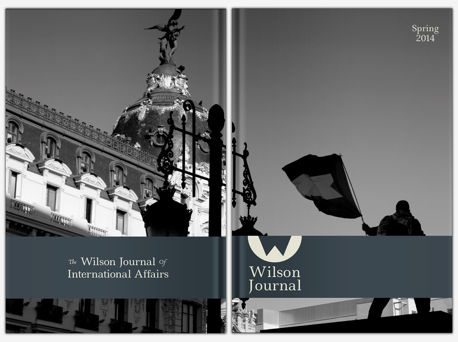
Cover
The printed book needed to diverge from the Journal's past in a memorable way, and the cover helps accomplish this goal.