ArcheMedX
client:
ArcheMedX
description:
ArcheMedX is a fast-growing startup that is changing the way physicians earn continued education credit. They brought me on to build out their brand, develop their website, and design all their publications.
date:
June, 2013–July, 2014
work:
Logo design, editorial design, graphic design, web design
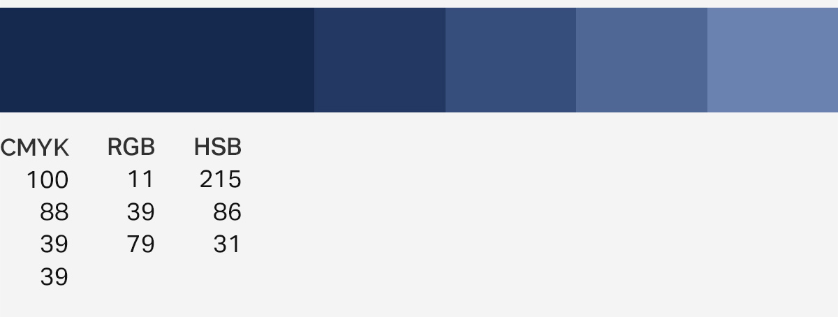
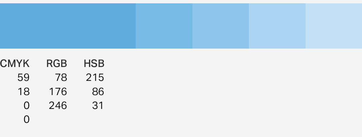
Colors
ArcheMedX needed a color palette for its web presense and publications. I drew two contrasting blues from the ArcheMedX logo, then extrapolated them to lighter shades for various paterns and buttons in the website.
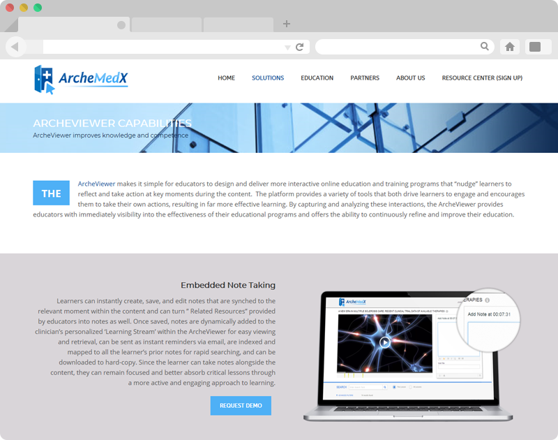
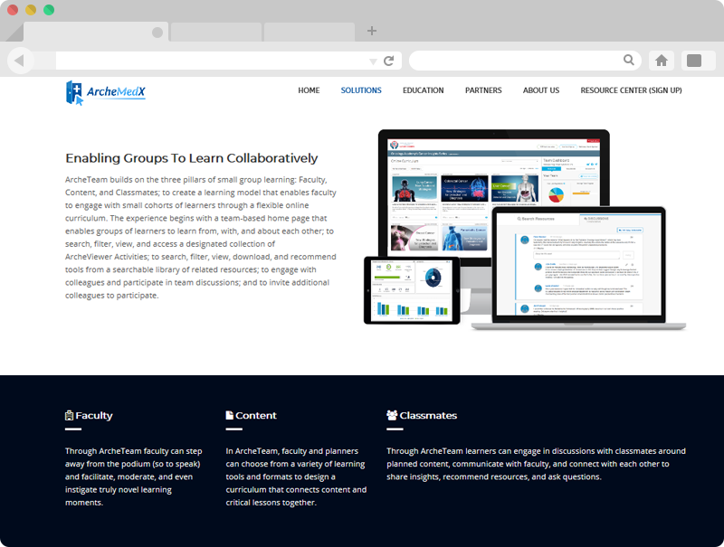
Web
The ArcheMedX company website offered an opportunity to communicate a whole picture of ArcheMedX.
From the thousands of resources and blog posts to the product descriptions; from the company history to the sign-in pages I designed each page around the content their team provided.
After the initial designs, we went through months of A/B testing to streamline the site.

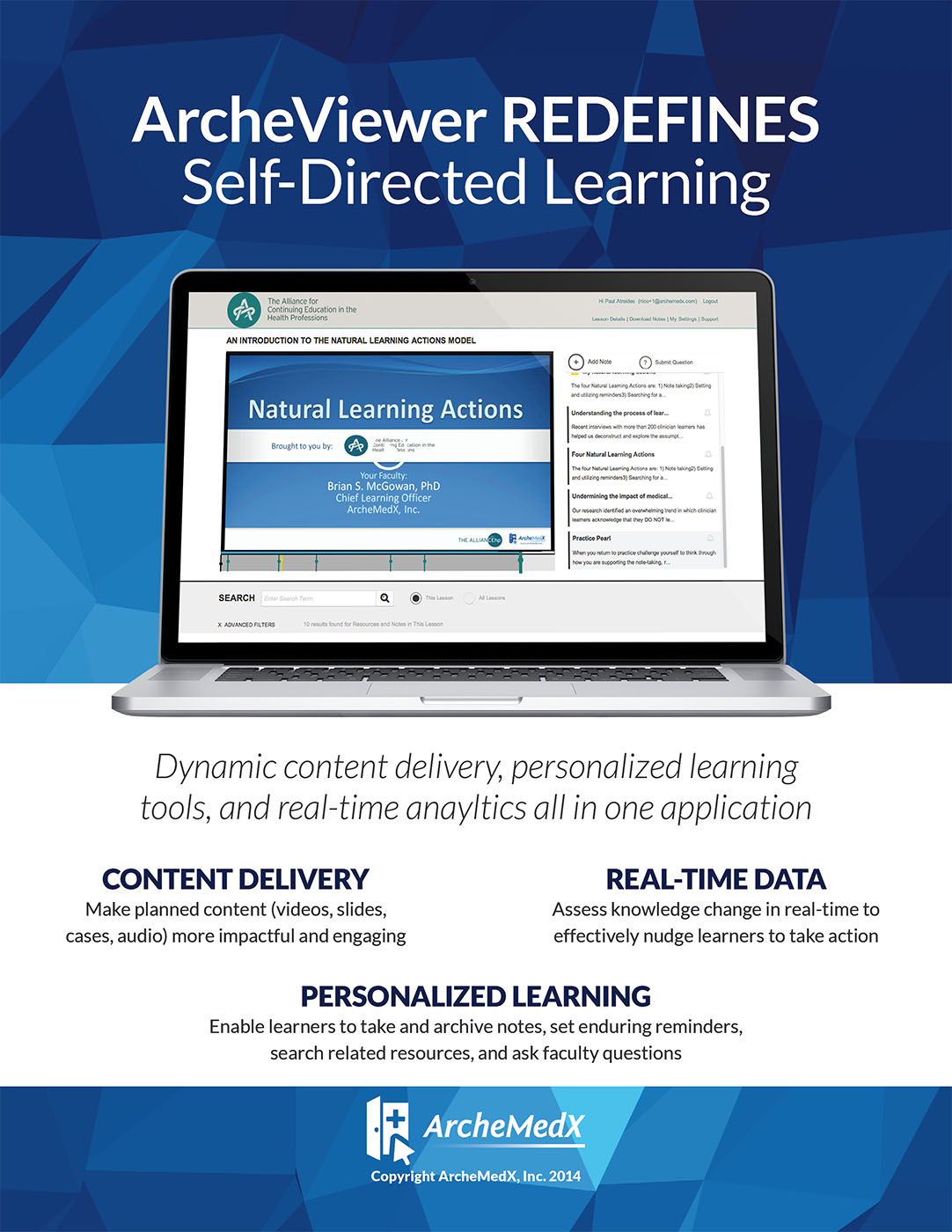
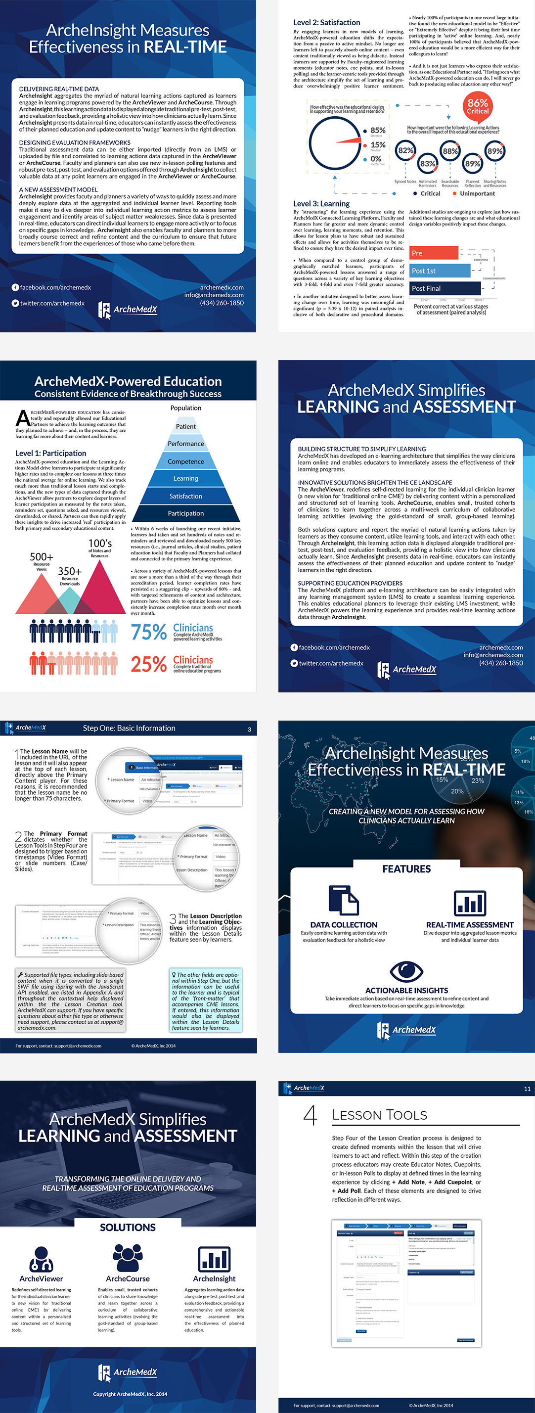
From flyers to product walkthroughs—from banners to sign-up sheets, I handled all of ArcheMedX’s literature. With measured and weighed typographic choices for both print and web, I made sure ArcheMedX appeared consistent and innovative throughout all of its public and client facing materials.
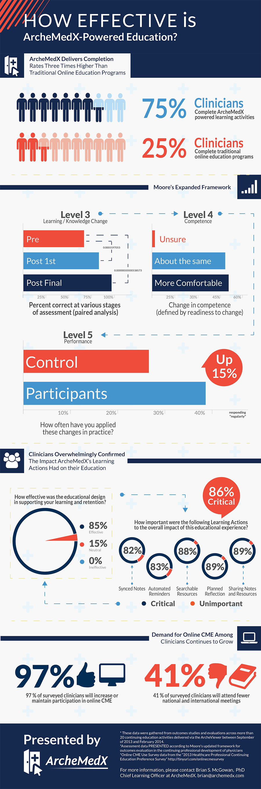
When building the ArcheMedX website and designing their printed materials, I often found the need for new graphics. ArcheMedX’s product—and the results their clients are earning with it—deserves high caliber communication: fresh graphs, simple type, understated mockups, and more.