Torch
description:
While thinking about the things around me, it struck me that desk & floor lamps use the same balancing mechanism as candle sticks. Torch is my attempt to change that.
date:
Ongoing
work:
Logo design, editorial design, graphic design, web design
Goal
To create a lamp with a disproportionately small base that would not fall over when tipped or moved. It needed to occupy less space on my desk while performing like any other desk lamp.
The Problem
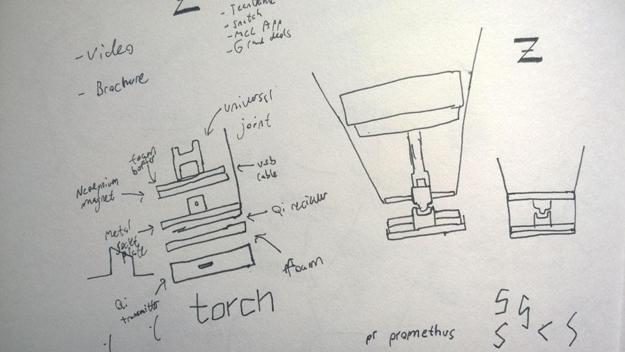
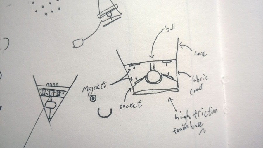
The most difficult aspect of creating a lamp with a small base is balance. Lamps have honking bases because they have no ability to move and stand evenly weighted.
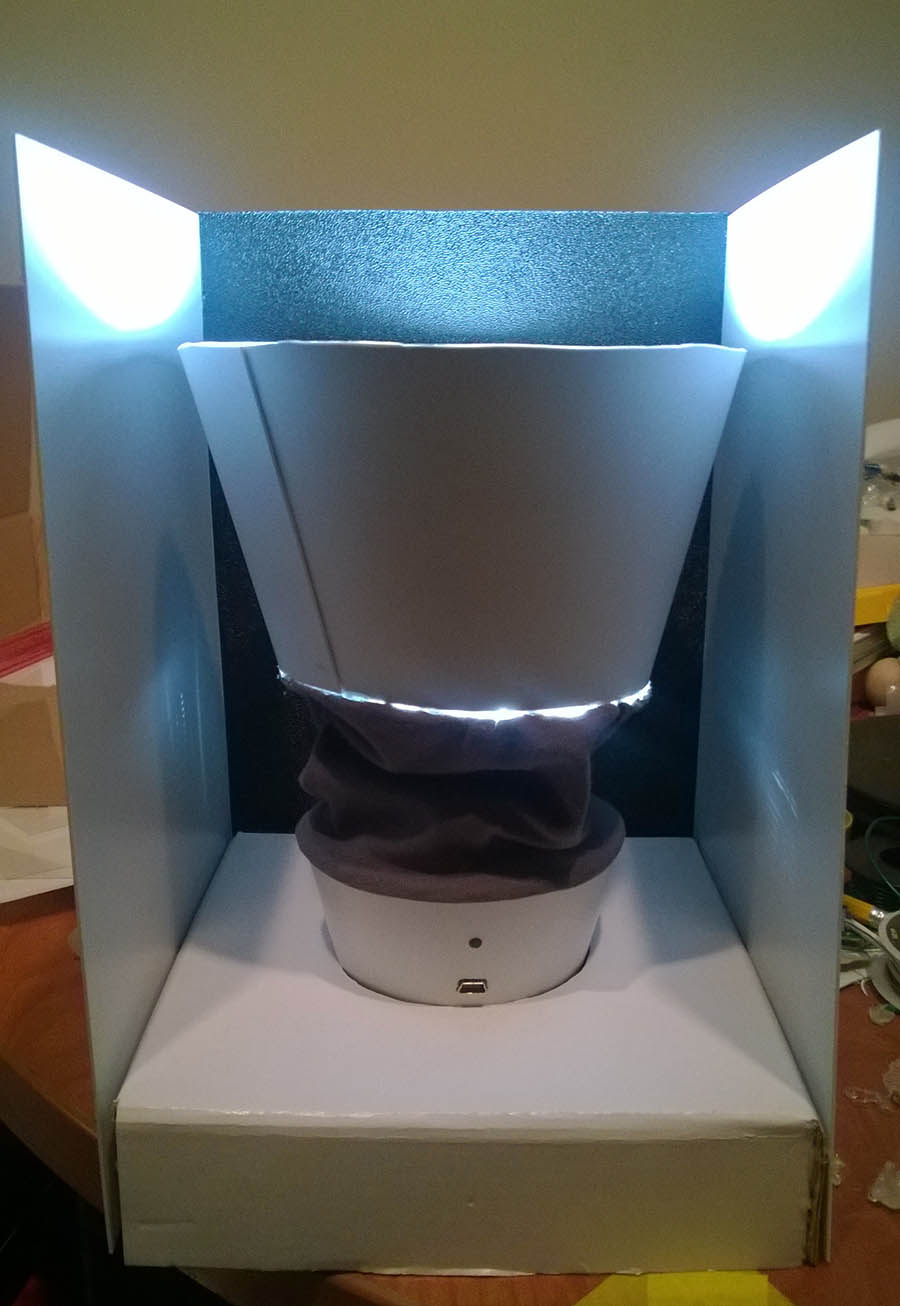
Prototypes 1 & 2
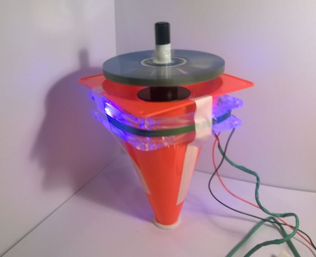
My first idea—one which I pursued with time and money throughout the first two major prototypes—was to use a motorized, battery-powered gyroscope.
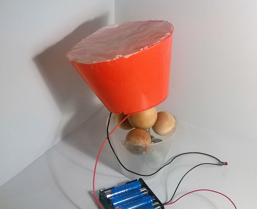
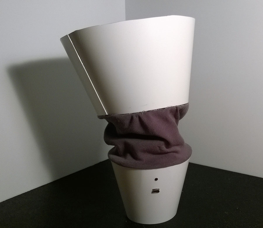
Prototypes 3 & 4
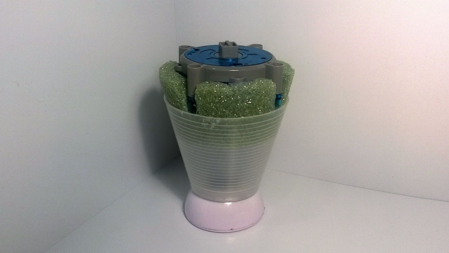
After abandoning the gyroscope idea, I began working to counterbalance the top portion—which houses the lights—with a small, dense weight in the base.
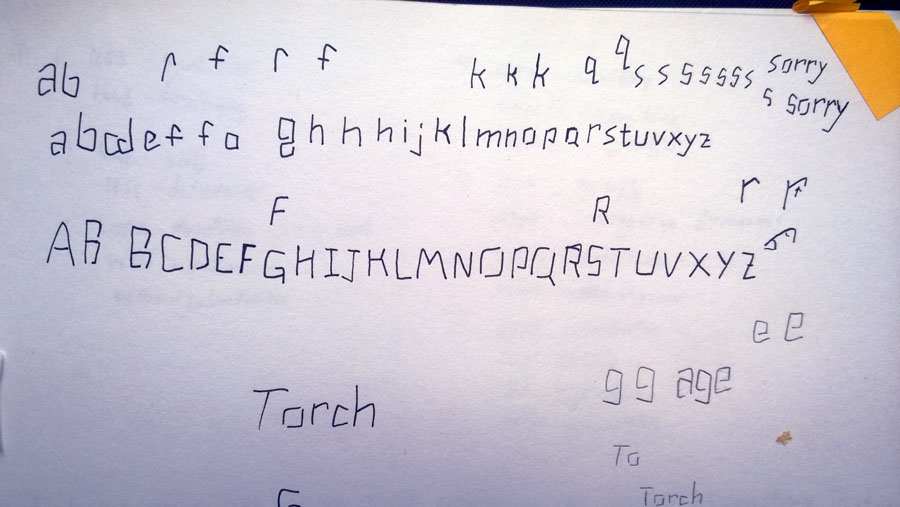
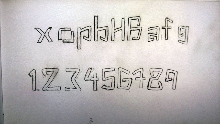
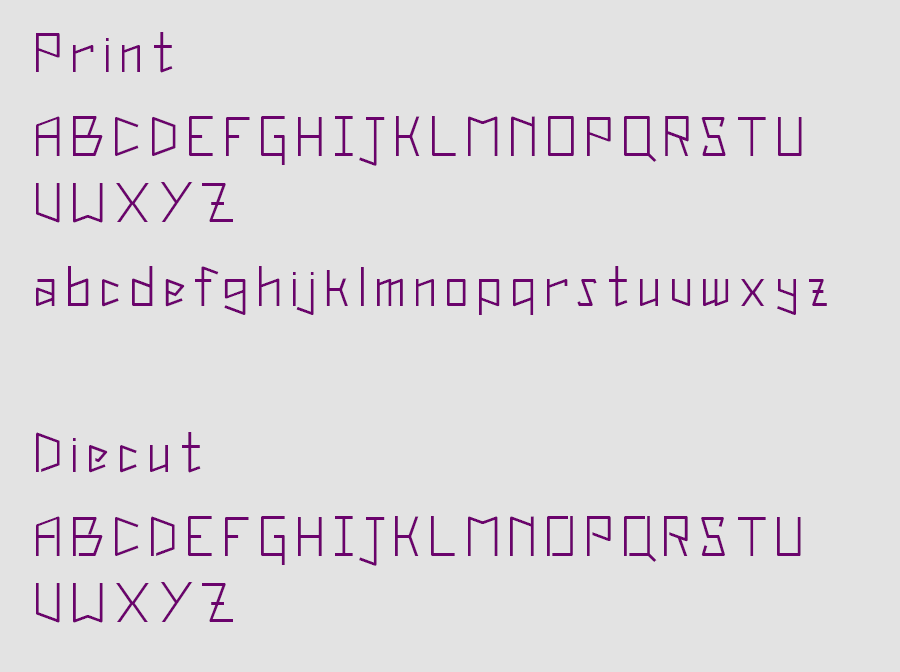
Typeface
As the fourth prototype neared completion, I decided that it needed sleek packaging. Of course, the packaging needed to bear the word "Torch." Becase I was cutting the name out of plastic, I needed a stencil font. After some searching, I decided to design my own.
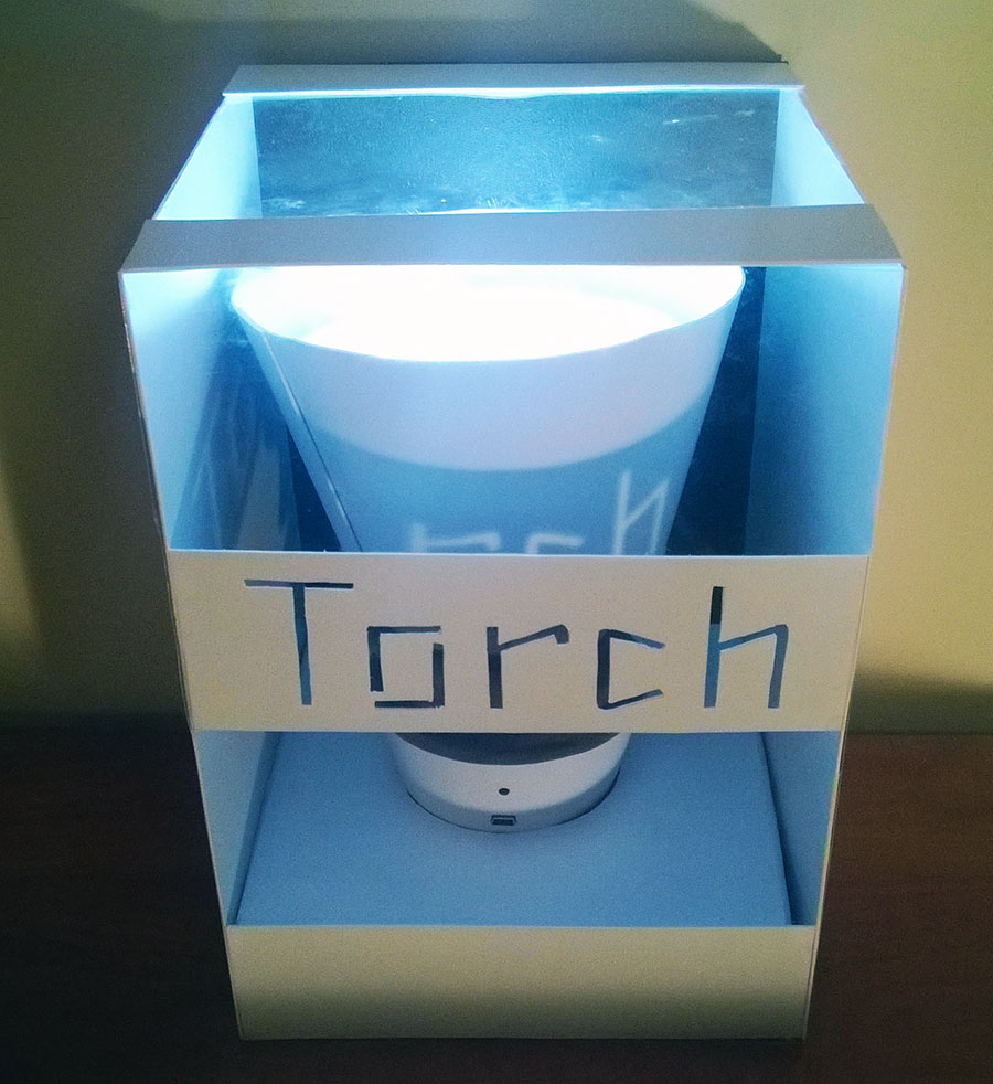
Packaging
I needed to produce packaging that would delight the user. This means: attractively displaying the lamp, constructing a strong box, prominently featuring the logotype, producing an easy opening experience, and reducing waste.
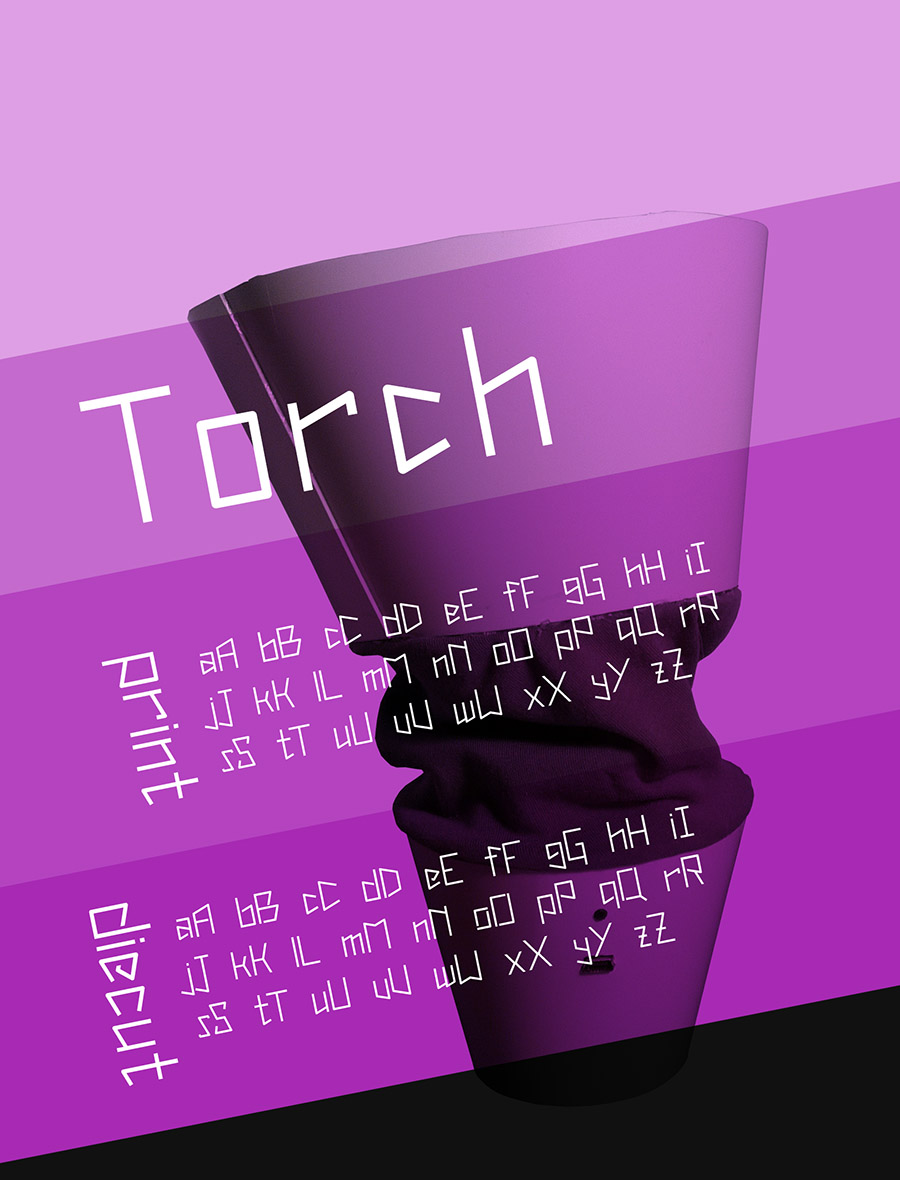
Poster & Specimen
Finally, to showcase the lamp and typeface, I created a poster. The angular design reflects both pieces of content.
To learn more about the project, go here.